Case Study
Redesigning the Co-op Bank Login Page
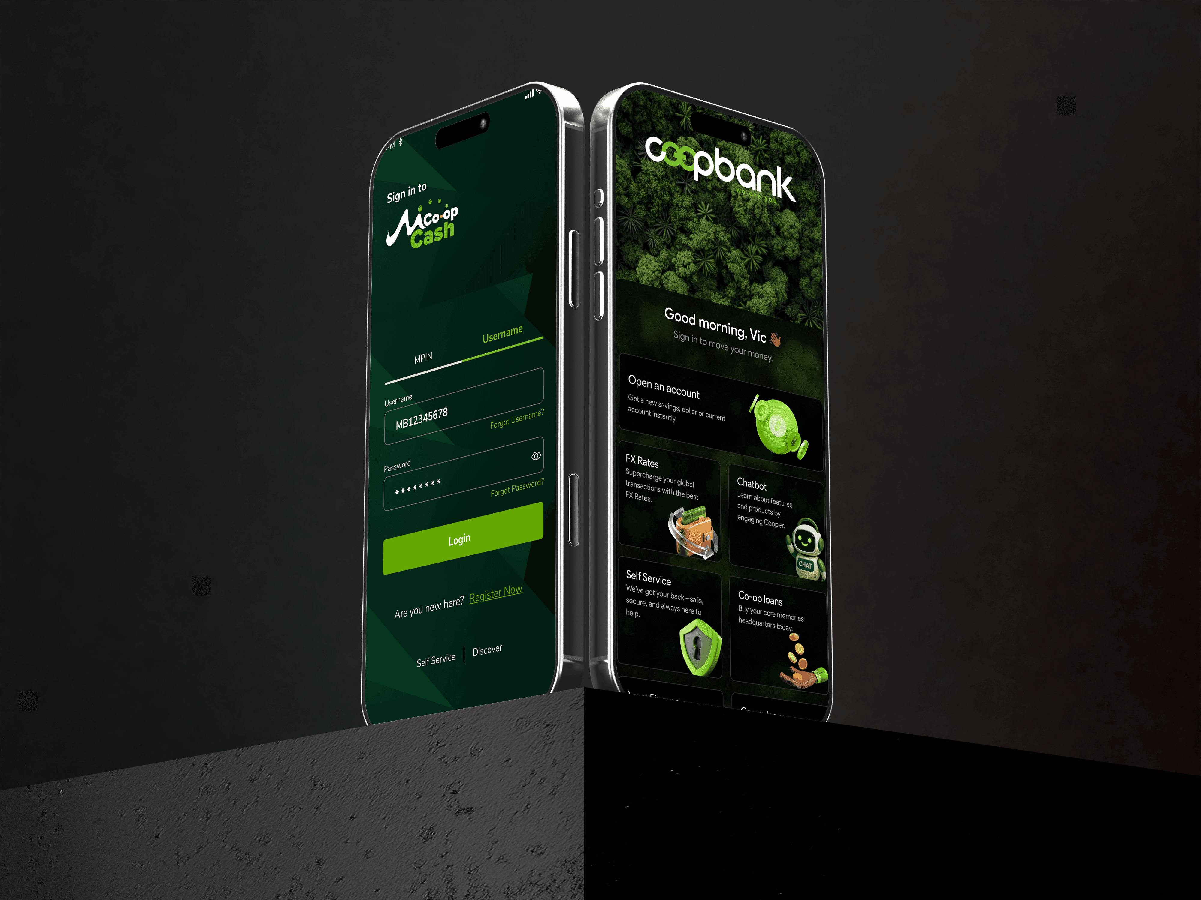
Transform the highest-traffic screen in the app from a static "utility gate" into a dynamic discovery hub that delivers value before authentication.
Overview & Strategy
- The Problem: For years, the login screen was a barrier that blocked users from simple information (like Forex rates or ATM locations) and missed opportunities for the bank to showcase products like Kamilisha (overdraft) or Loans.
- The Solution: A modular, dynamic architecture balancing three pillars: Marketing Discovery, Self-Service Empowerment, and Secure Authentication.
The Process
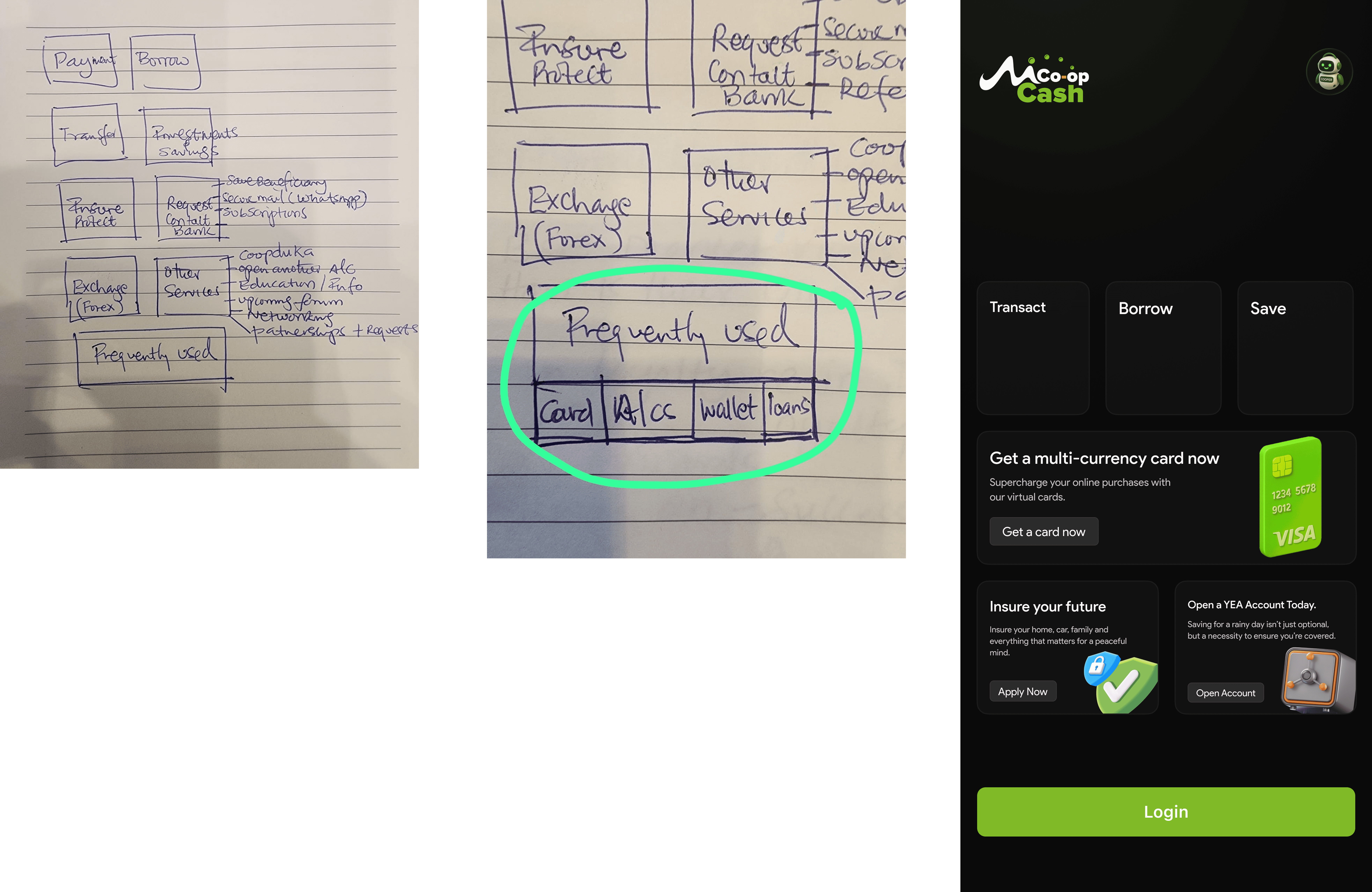
- Evidence-Based Design: Anchored in support log analysis and user interviews. Discovered that many "login attempts" were actually users seeking quick info (rates) or help (locked out).
- Prioritization Matrix: Used to determine which features (like Kamilisha banners and Branch Locator) earned "prime real estate" outside the login gate.
- Benchmarking: Competitive analysis against global neobanks to ensure a world-class experience tailored for the Kenyan market.
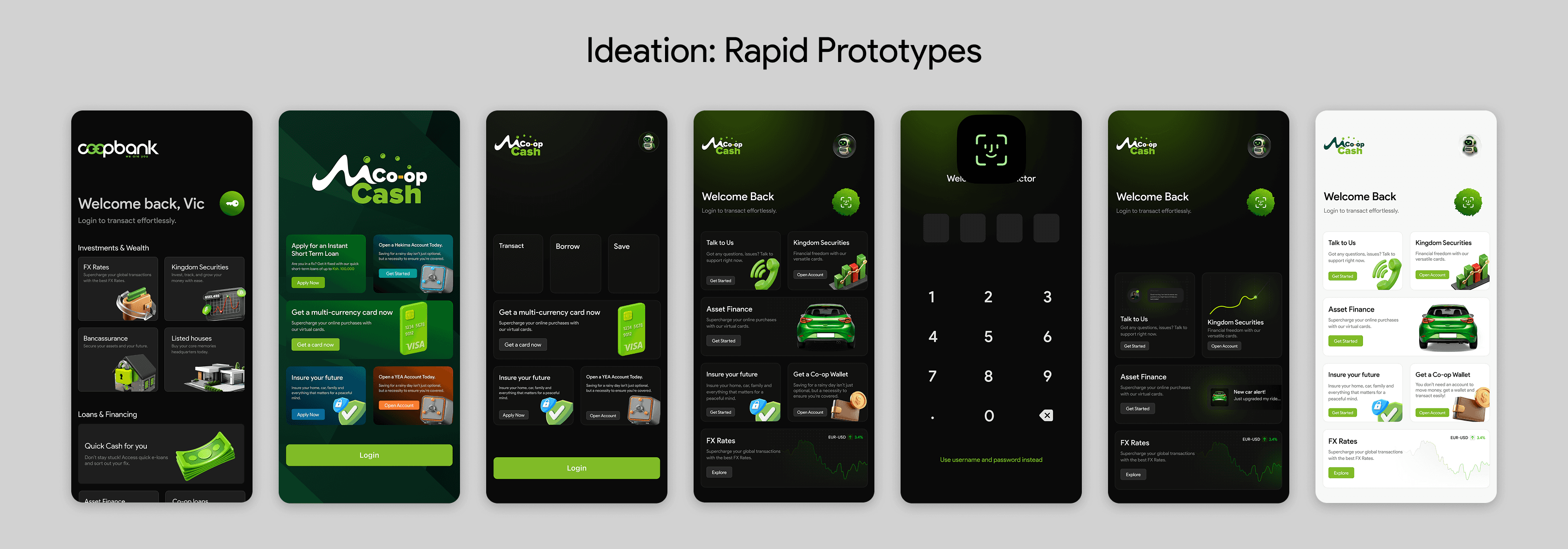
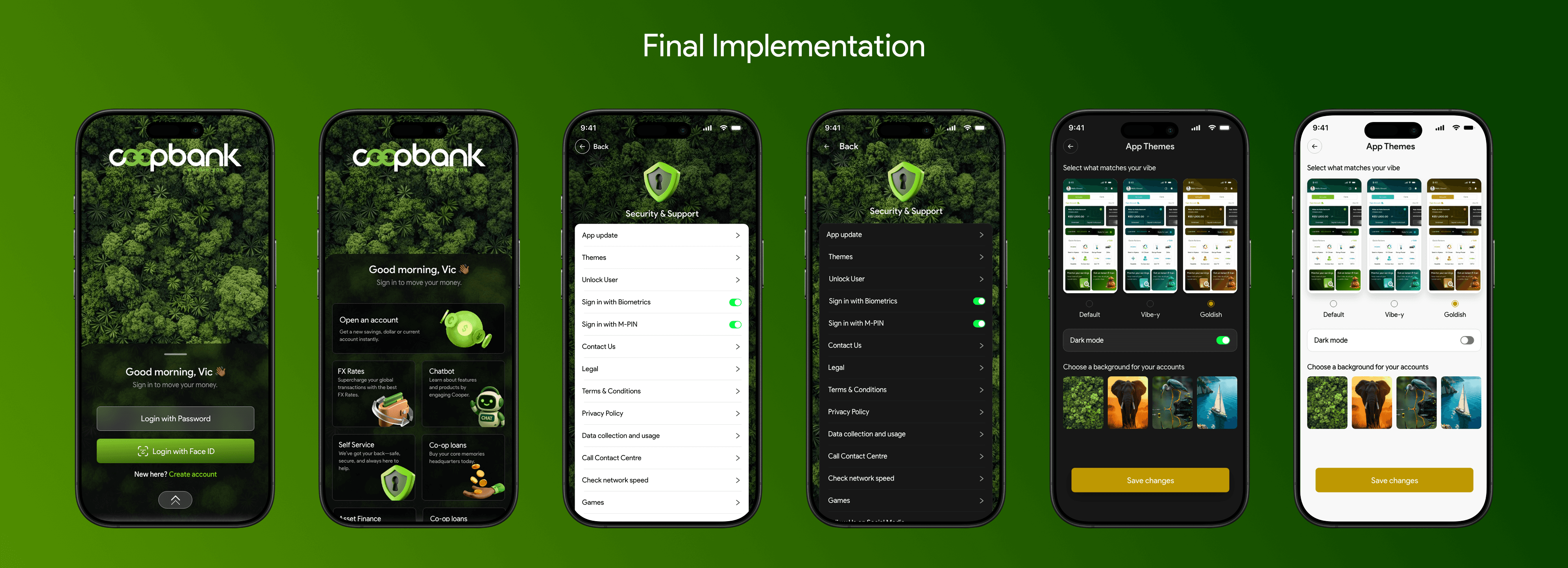
Implementation
- Visual Direction: Leveraged the bank's "Kingdom" branding, elevated with depth, subtle gradients, and crisp iconography.
- Technical Leadership: Acted as a bridge between design and engineering, ensuring the live product was built with "native-first" principles for smooth animations and responsive layouts across all devices (high-end to entry-level).
Outcomes & Impact
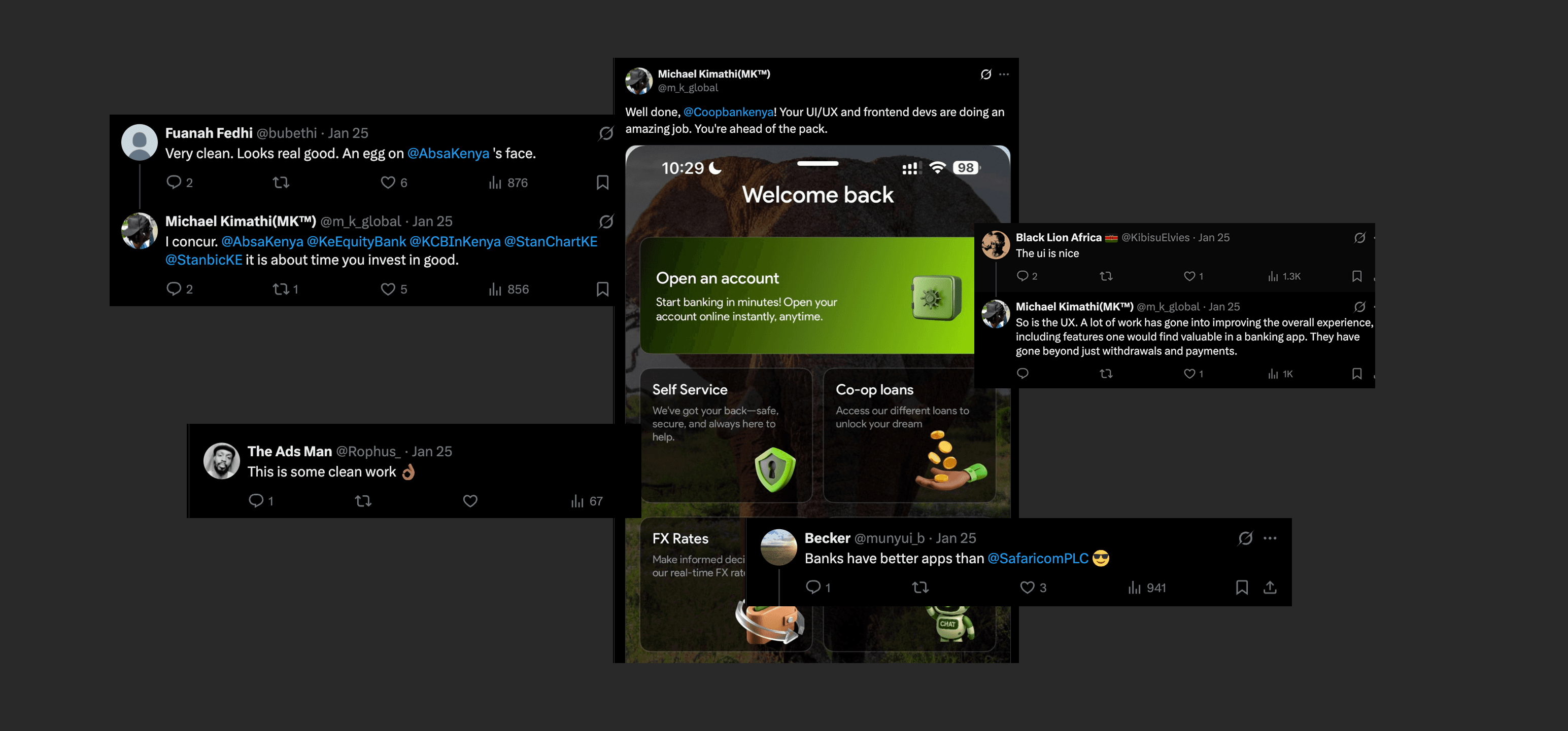
- Social Proof: Sparked organic positive sentiment, with users publicly applauding the "cleaner vibe."
- Behavioral Shift: Immediate uptick in pre-login engagement with product banners.
- Operational Efficiency: Reduced friction by moving high-frequency help tasks to the front of the app.
"When a user takes the time to publicly applaud a banking app's login screen, you know you've moved beyond utility into an emotional connection."